Creating interactive dashboards in Excel transforms complex data into insightful, easy-to-understand visuals that empower decision-making. These dashboards enable users to dynamically filter, analyze, and present data without needing advanced technical skills. In this article, we’ll explore practical steps to build effective Excel dashboards that are visually appealing and highly functional.
Designing a User-Friendly Layout for Your Dashboard
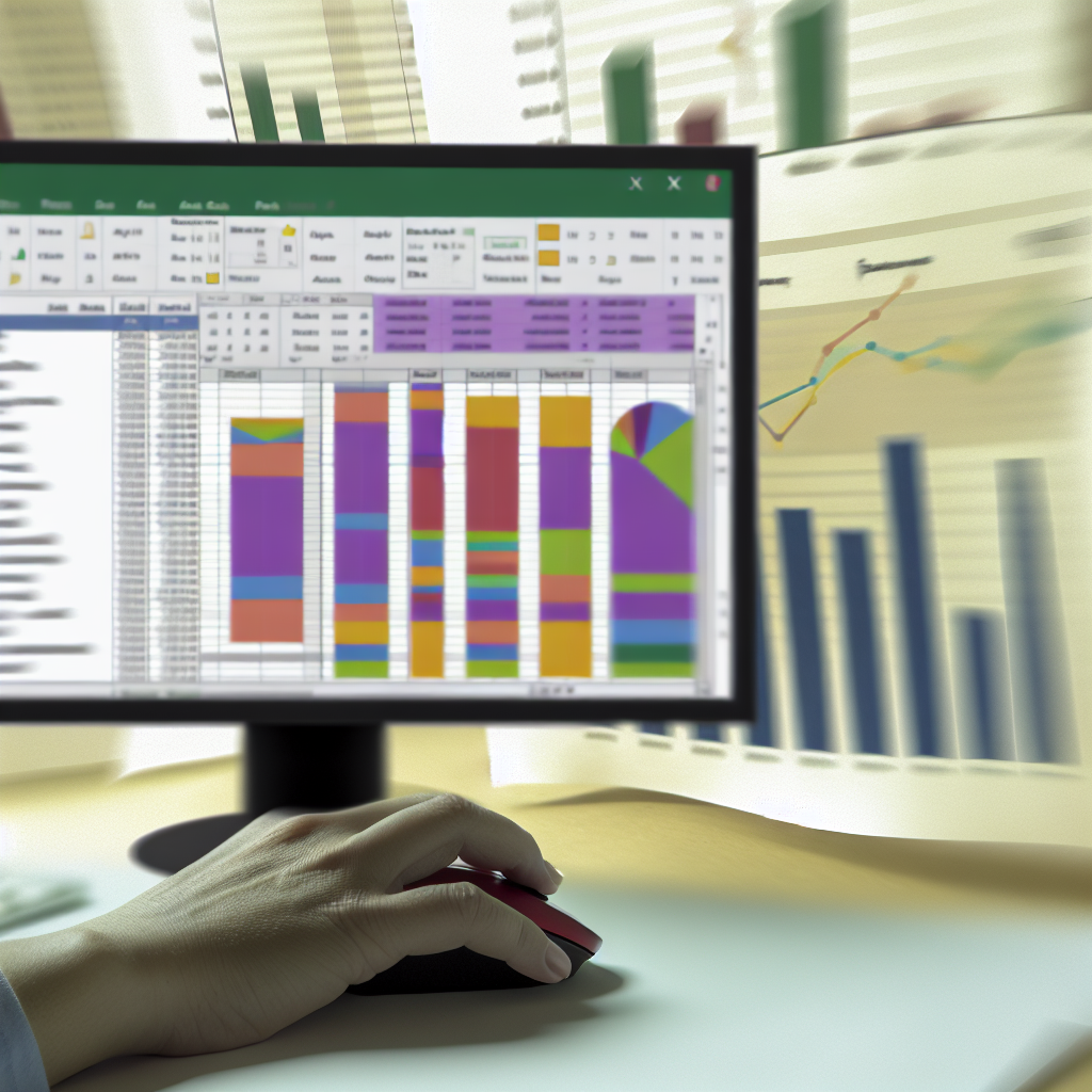
To create an engaging and easy-to-navigate Excel dashboard, start with a thoughtful layout that prioritizes clarity and accessibility. Use a clean grid structure, grouping related visuals together. Incorporate visual hierarchy by placing the most critical metrics at the top or center of the dashboard, ensuring they capture immediate attention.
Leverage Excel’s formatting tools to enhance readability, including consistent color schemes, font choices, and borders. Utilize cell borders and shading to delineate different sections and prevent visual clutter. Additionally, employ slicers and dropdown menus for interactive filtering, allowing users to customize views without altering the underlying data.
Utilizing Excel Features for Interactivity and Automation
An interactive dashboard relies on Excel’s advanced features to enable dynamic data analysis. **PivotTables and PivotCharts** are core components that allow for quick data summarization and visualization. Pair these with **Slicers** to introduce user-driven filtering options that update visuals in real-time.
Furthermore, incorporate **form controls** such as checkboxes and sliders to add more interactive elements. For automation, utilize formulas like **SUMIFS**, **COUNTIFS**, and **VLOOKUP** to link data points and automate calculations. Consider using **Macros** or **Power Query** for complex data transformations and updates, ensuring your dashboard remains current with minimal manual effort.
Conclusion
Building an Excel interactive dashboard combines thoughtful design, strategic use of features, and automation techniques to deliver a powerful analytical tool. By prioritizing user-friendliness and interactivity, you can transform raw data into compelling visual stories that facilitate better decision-making. With these insights, you’re ready to craft dashboards that impress and inform effectively.