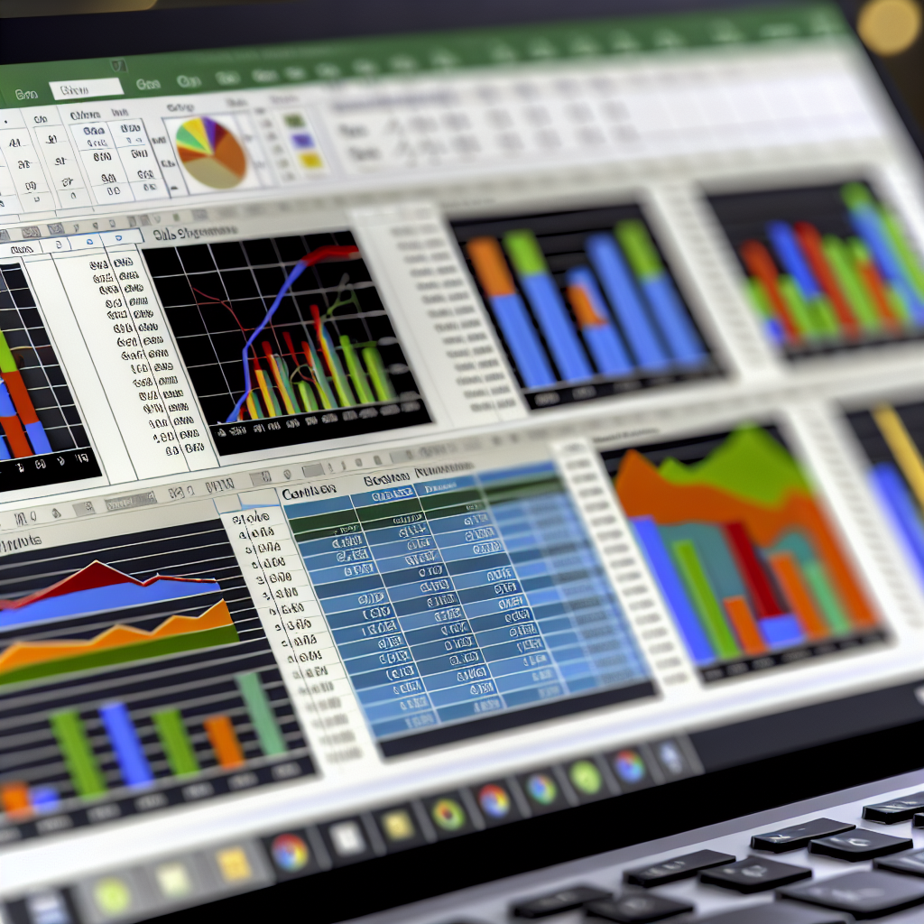
Creating a **powerful sales Excel dashboard** is essential for sales teams aiming to visualize performance metrics, identify trends, and make data-driven decisions effectively. An optimized dashboard consolidates key sales data into a single, interactive interface, simplifying complex information. In this article, we’ll explore how to design a sales dashboard in Excel that boosts productivity and enhances strategic planning.
Designing an Effective Sales Data Structure for Your Dashboard
The foundation of a **powerful sales Excel dashboard** lies in a well-organized data structure. Before building visualizations, ensure your raw data is clean, consistent, and comprehensive. This includes categorizing sales data into essential fields such as date, sales amount, region, product, and sales representative. Using Excel tables enhances data management by enabling dynamic referencing, which is crucial for creating interactive dashboards.
Implement data validation and consistency checks to minimize errors, ensuring that trends and insights drawn from your dashboard are reliable. Once your data is structured properly, leverage Excel functions like SUMIFS, COUNTIFS, and AVERAGEIFS to pre-calculate key metrics that will populate your dashboard. Combining this with pivot tables allows for quick aggregation and flexible data analysis, making your dashboard more responsive to different queries and filters.
Building Interactive Visualizations for Actionable Insights
With a solid data foundation, focus on creating visual elements that communicate your sales performance clearly. Use Excel’s charting tools to develop **dynamic charts** such as line graphs for sales trends, bar charts for regional comparisons, and pie charts for product share analysis. To make these visualizations more impactful, incorporate features like **slicers** and **timelines** that enable users to filter data interactively, facilitating tailored insights on demand.
Enhance the dashboard’s usability by integrating features such as conditional formatting to highlight top performers or underperformers, and KPI indicators that display critical metrics like total sales, conversion rates, or sales growth percentage. Consider adding a **dashboard overview section** that summarizes key performance indicators at a glance, giving decision-makers quick access to the most relevant data. Remember, the goal is to transform raw sales data into visually compelling insights that support strategic decisions and drive sales growth.
Creating a **powerful sales Excel dashboard** involves meticulous data structuring and strategic visualization design. When executed properly, it provides a comprehensive view of sales performance, enabling teams to identify opportunities and address challenges proactively. By following these steps, you’ll develop an interactive dashboard that improves reporting efficiency and fosters data-driven sales strategies.
